Arithmetic Grade Five
Lesson One hundred and sixty-five: Pie Graphs
Pie graphs (sometimes called circle graphs)
are another way to present information. Take a close look at the
following example:

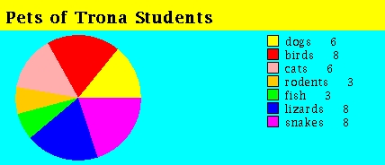
This pie graph displays information about the pets of Trona students. The
more kids who have a certain pet, the bigger the slice of the pie that goes
with the pet. You can use the guide on the right side of the graph area to
see which color represents which pet.
Using this chart we can answer questions like:
  1) Which pets are owned by the most students?
     ANSWER: birds, lizards, and snakes

  2) Which pets are least popular?
     ANSWER: rodents and fish

  3) How many more kids own birds than dogs?
     ANSWER: 8 - 6 = 2
Here's another pie graph to inspect.

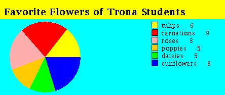
This pie graph provides information about the favorite flowers of Trona
students.
Using this chart we can answer questions like:
  1) What is the most popular flower?
     ANSWER: carnation

  2) Which two flowers were the favorites of eight kids?
     ANSWER: roses and sunflowers

  3) How many more kids liked tulips than daisies?
     ANSWER:  6 - 5 = 1
Click here to go to next page

