Arithmetic Grade Five
Lesson One hundred and sixty-four: Line Graphs
Line graphs are another way to present information. Take a close look at the
following example:

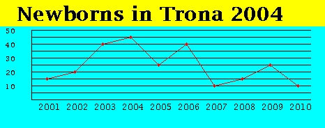
This line graph gives a year-by-year total of births in a small town (Trona,
CA, population: approx. 2000). A high is reached in 2004 with 45 births and
the lows are 2007 and 2010 with 10 births each. Line graphs are particularly
good for presenting information which changes over time.
Using this chart we can answer questions like:
  1) How many babies were born in Trona in 2005?
     ANSWER: 25

  2) How many more babies were born in 2005 than 2010?
     ANSWER: 25 - 10 = 15

  3) How many babies were born between 2001 and 2010?
     ANSWER: 15 + 20 + 40 + 45 + 25 + 40 + 10 + 15 + 25 + 10 = 245
Here's another line graph to inspect.

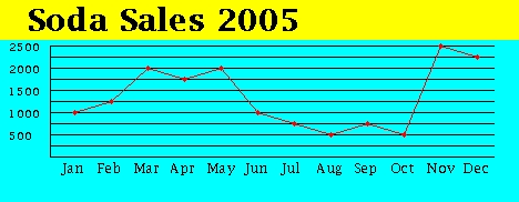
This bar graph represents the number of cases of soda sold during the year
2005 (but it tells us nothing about where).
Using this chart we can answer questions like:
  1) During what month was the most soda sold?
     ANSWER: November

  2) How many cases were sold during October?
     ANSWER: 500

  3) What is the difference in cases of soda sold for July and April?
     ANSWER:  1750 - 750 = 1000
Click here to go to next page

