Arithmetic Grade Five
Lesson One hundred and sixty-two: Bar Graphs
Bar graphs are another way to present information. Take a close look at the
following example:

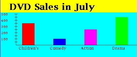
This bar graph represents DVD sales. On the left side is a scale showing the
number of units sold. This scale shows the numbers 100, 200, 300, 400, and
500 with lines for each of these numbers. Other lines are between each of
these values. These lines represent 50, 150, 250, 350, and 450. In this
example there are four types of DVDs being compared: Children's, Comedy,
Action, and Drama. These labels appear along the bottom of the chart. The
bars of different colors represent the sales for each of these types of DVD.
According to this chart:
- 350 Children's DVDs were sold
- 100 Comedy DVDs were sold
- 250 Action DVDs were sold
- 450 Drama DVDs were sold
Using this chart we can answer questions like:
  1) Which type of DVD sold the most?
     ANSWER: Drama

  2) How many Action DVDs were sold than Comedy DVDS?
     ANSWER: 250 - 100 = 150

  3) How many Comedy and Action DVDs were sold in all?
     ANSWER: 100 + 250 = 350
Here's another bar graph to inspect.

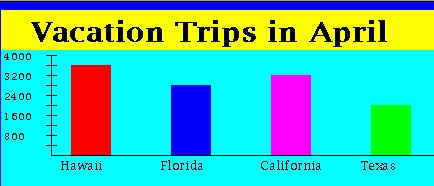
This bar graph represents the number of vacation trips people took to
various places. According to this chart:
- 3600 people went to Hawaii on vacation
- 2800 people went to Florida on vacation
- 3200 people went to California on vacation
- 2000 people went to Texas on vacation
Using this chart we can answer questions like:
  1) Where did the largest number of people go on vacation?
     ANSWER: 3600

  2) How many people went to Texas on vacation?
     ANSWER: 2000

  3) How many more people went to Hawaii than Texas?
     ANSWER: 3600 - 2000 = 1600
Click here to go to next page

